Eephus Brewing Co.
Eephus Brewing Co. started in 2020 as my personal homebrewing project where I combined my love of baseball with my dreams of creating unique, flavor-forward beers to build out my brand position. I landed on the name Eephus, which is a low-speed, trick pitch that catches batters off guard—just like I’m hoping my beers will have a unique twist that catches the drinker off-guard.
Services
Naming
Identity Design
Visual Language
Brand Positioning
Package Design


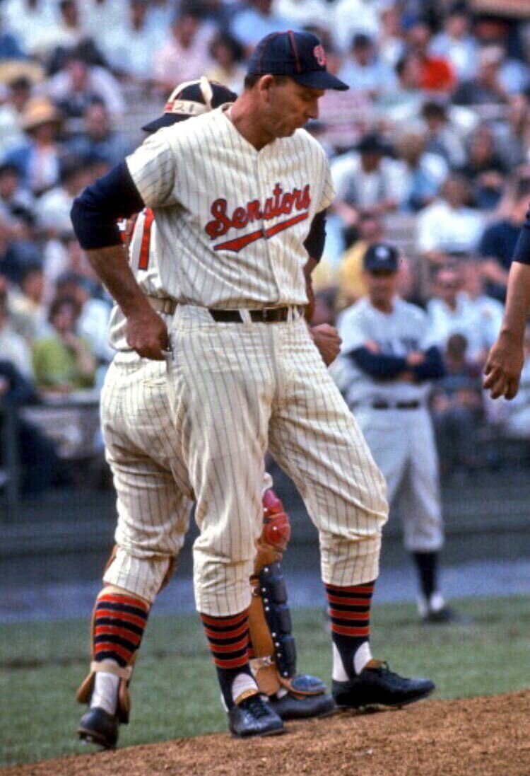
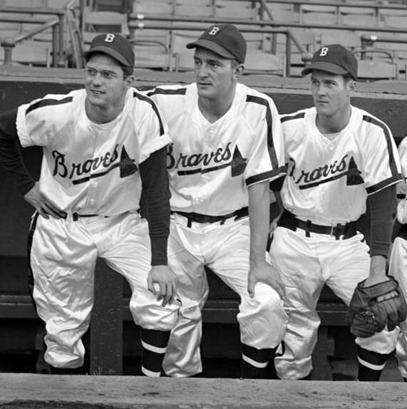
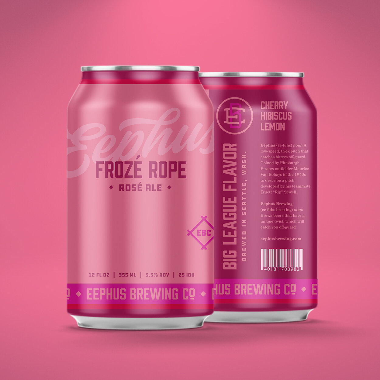
To create the packaging, I looked to baseball uniforms throughout the decades as my inspiration. The bold script across the can is an homage to vintage baseball uniforms of the 40s and 50s where many teams proudly featured their team name across the chest. The striped element on the top and bottom of the cans mirrors the look and feel of the iconic striped socks. The color palette of the packaging, themselves, is a callout to uniforms from the 70s and 80s where many teams started using daring colors. Each brew has a unique, color-blocked look that fits the name and ingredients of the beer itself.


From a branding perspective, I tapped into baseball jargon to help name the beers.
Suicide Squeeze
When you have a runner on third and the batter bunts with the hopes of getting the infield to throw to first so the runner on third can squeeze home.
A Hazy Citrus India Pale Ale brewed with grapefruit and orange peel, Citra and Mosaic hops. This beer has a full-bodied mouthfeel that is smooth and juicy.
Knothole Gang
A throwback to the name given to the group of kids that loved baseball so much they would watch it through knotholes in the fence in the outfield.
We’re not advocating for underage drinking, but this easy drinking Mild Dark Ale would be the drink of choice for those back-alley kids of the 20s. Based on early English Ales, we’ve infused this easy drinker with black licorice to give it a palatable bite.
In a Pickle
If you’re a baseball watcher, you’ve likely seen that moment when the baserunner is stranded between two bases and is in jeopardy of being tagged out.
Our twist on a classic German-style pilsner, we’ve brewed this with pickling spices to give you all the flavor without the vinegar.
Pine Tar
Pine Tar is the brownish-black tacky substance that players use on their bats to help improve their grip and prevent the bat from flying out of their hands.
Brewed with Cascade, Simcoe, and Chinook hops to give that piney flavor, our Imperial Porter is similar to the consistency of pine tar, dark, thick, and rich.
Six-Four-Three
One of your most common double plays where the shortstop fields the ball and throws it to the second baseman, who in turn throws it to first baseman to make your double play.
A well balanced Double IPA that is dry-hopped with Mosaic and Simcoe to give you the aromas of fresh cut grass and imbue a slight piney flavor. We brewed this beer with a touch of honey and orange peel to give a balance to the hoppy bitterness.
Frozé Rope
A play on the term “frozen rope” where a fastball is crushed so perfectly by the batter that in an outcome that almost defies physics, the ball pretty much stays parallel with the earth.
Perfect during the dog days of summer when those pennant races start heating up, this hybrid fruit beer blends pinot noir must into the fermentables to give you that perfect crushable beer for day games sitting in the bleachers.


